C.A.R.L
User Experience / User Interface
C.A.R.L is an immersive and interactive tour experience centered on the University of Florida campus, designed in collaboration with UF Libraries and MINT Design Studio.
C.A.R.L stands for Collections through Augmented Reality Learning, and combines augmented reality technology with the university’s rich history to create a tour experience like no other. Use the app remotely or on campus, and follow along with the historian-approved digital tours.
Contributors: Kendall Brandt, Janelys Camelo, Sarah Cantor & Ian Costello
Onboarding
The onboarding process is used to introduce users to the app and its main features: Linear Tours, Achievements, Archives, Map & Scan
Home Screen
The Home screen serves as a dashboard where users can access the app settings, read about featured items from the archives, and find nearby access points to scan.
Access Points
The Scan feature allows users to access augmented reality timelines through kiosks placed around the University of Florida campus.
AR + Info View
After interacting with information presented through augmented reality timelines, users can swipe up to the Info View for more information on an artifact or location.
| research |
Research Steps:
1| Conducted stakeholder interviews
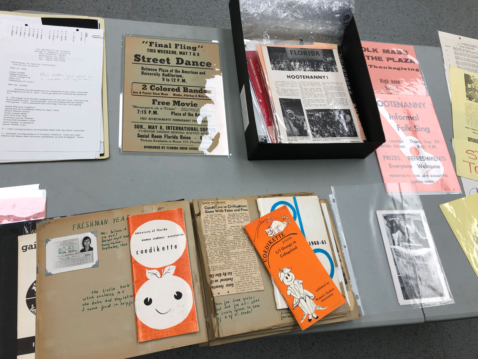
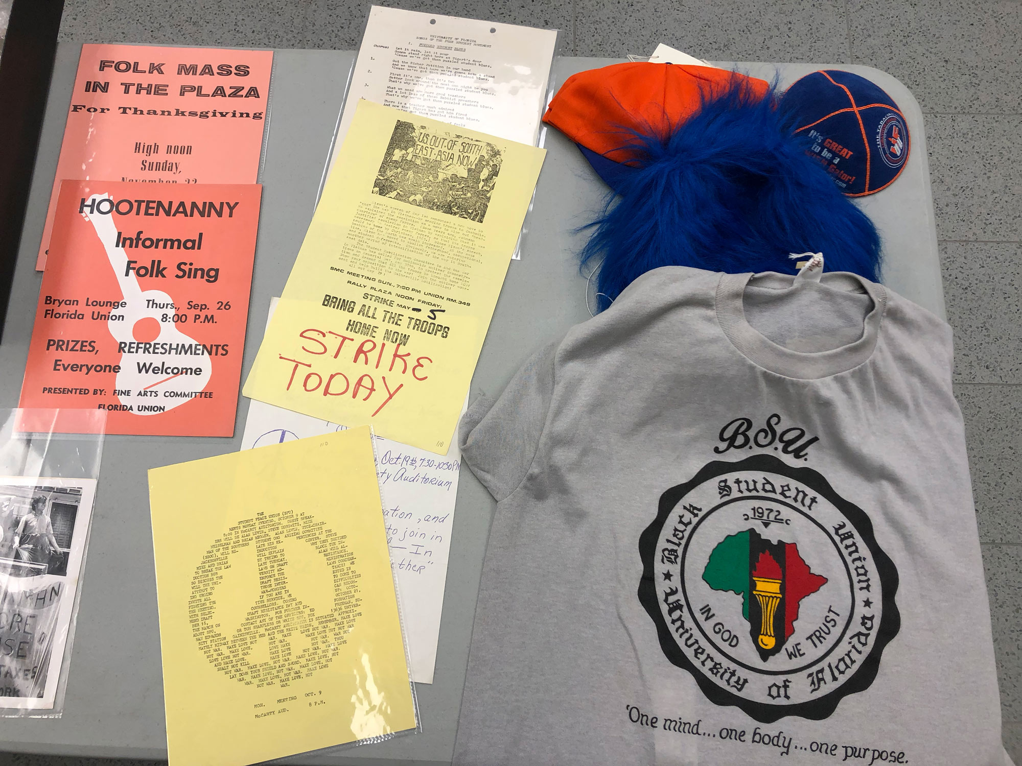
2| Participated in a tour of historical documents and artifacts
3| Performed a competitive analysis for similar campus tours
4| Performed a competitive analysis for mobile apps that utilize AR technology to display information and/or educate users
5| Determined the current tour's strengths + weaknesses
Identified Objectives:
1| Utilize Augmented Reality technology in a purposeful way that allows for a greater depth of knowledge
2| Create personalized tour experiences for a wide range of audiences
3| Connect the university archives with and introduce exciting elements of UF history to a larger audience
4| Stay true to the tailored experience that Carl provides each of his participants
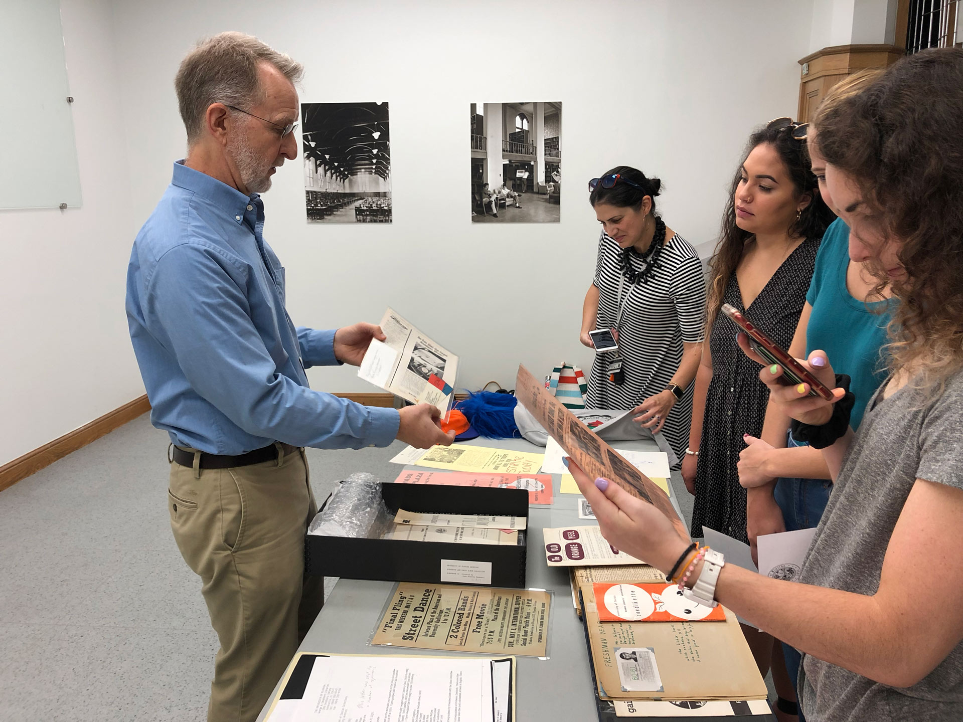
Carl Van Ness and the C.A.R.L team examining physical artifacts and documents
| visual identity |
Brand Strategy:
Showcase and integrate historic content in a clear, innovative, and fresh way
Design a universally-appealing aesthetic that will withstand design trends
Integrate flexibility within the visual system to allow for organization and categorization
Brand Components:
Clean, versatile logo/wordmarks
Vibrant yet traditional color palette
Flexible gradient and patterns
Bold, legible typefaces
Eye-catching image treatments
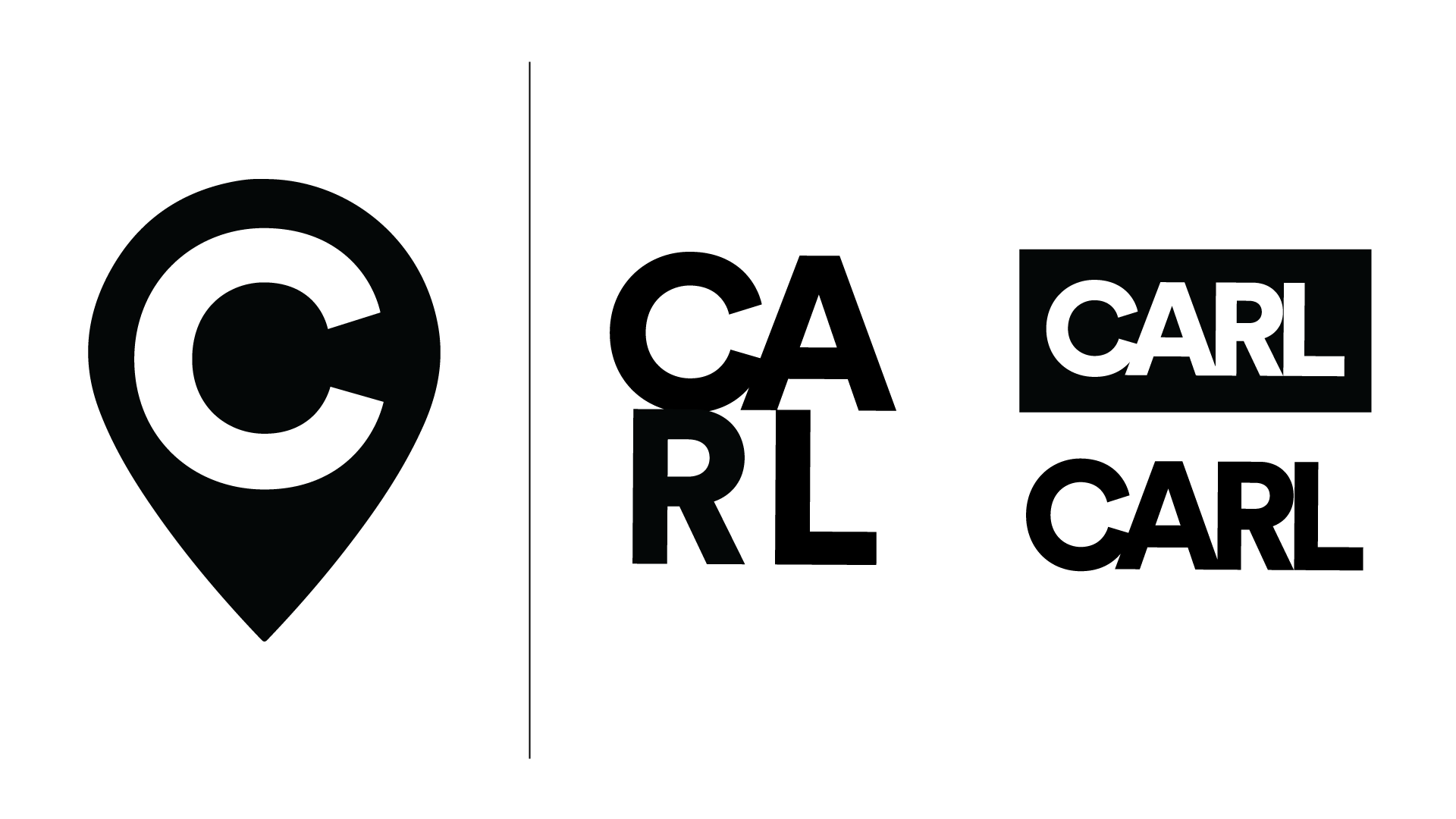
Primary Logomark
Alternate Logos
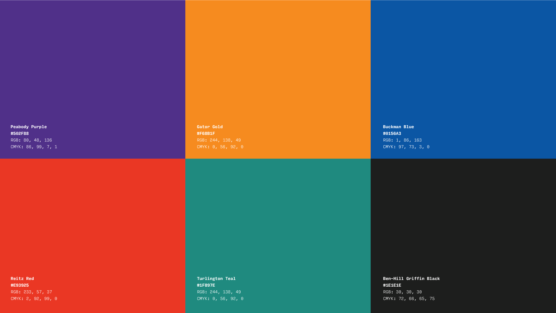
Color Palette
Gradient
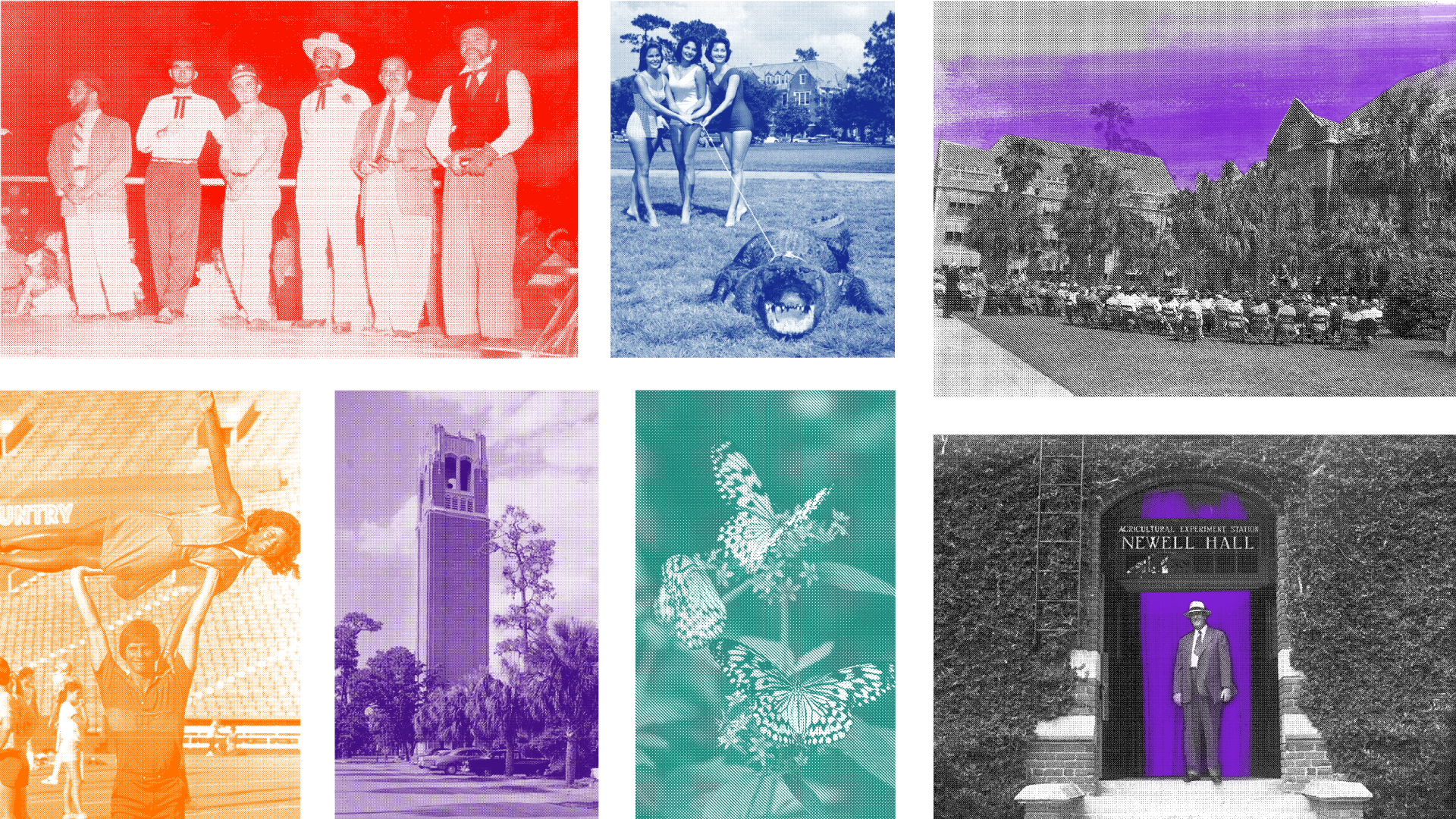
Half-Tone Image Treatments
| user experience |
User Interface Goals:
Incorporate imagery in an organized, digestible manner
Implement a clean, high-contrast visual system
Categorize information to keep interface organized
Maintain consistent visual cues for navigational ease
User Experience Goals:
Create a memorable experience that keeps users engaged
Build interactions that feel familiar and intuitive
Provide an engaging, educational experience across multiple access points
Encourage the user to frequently visit the app
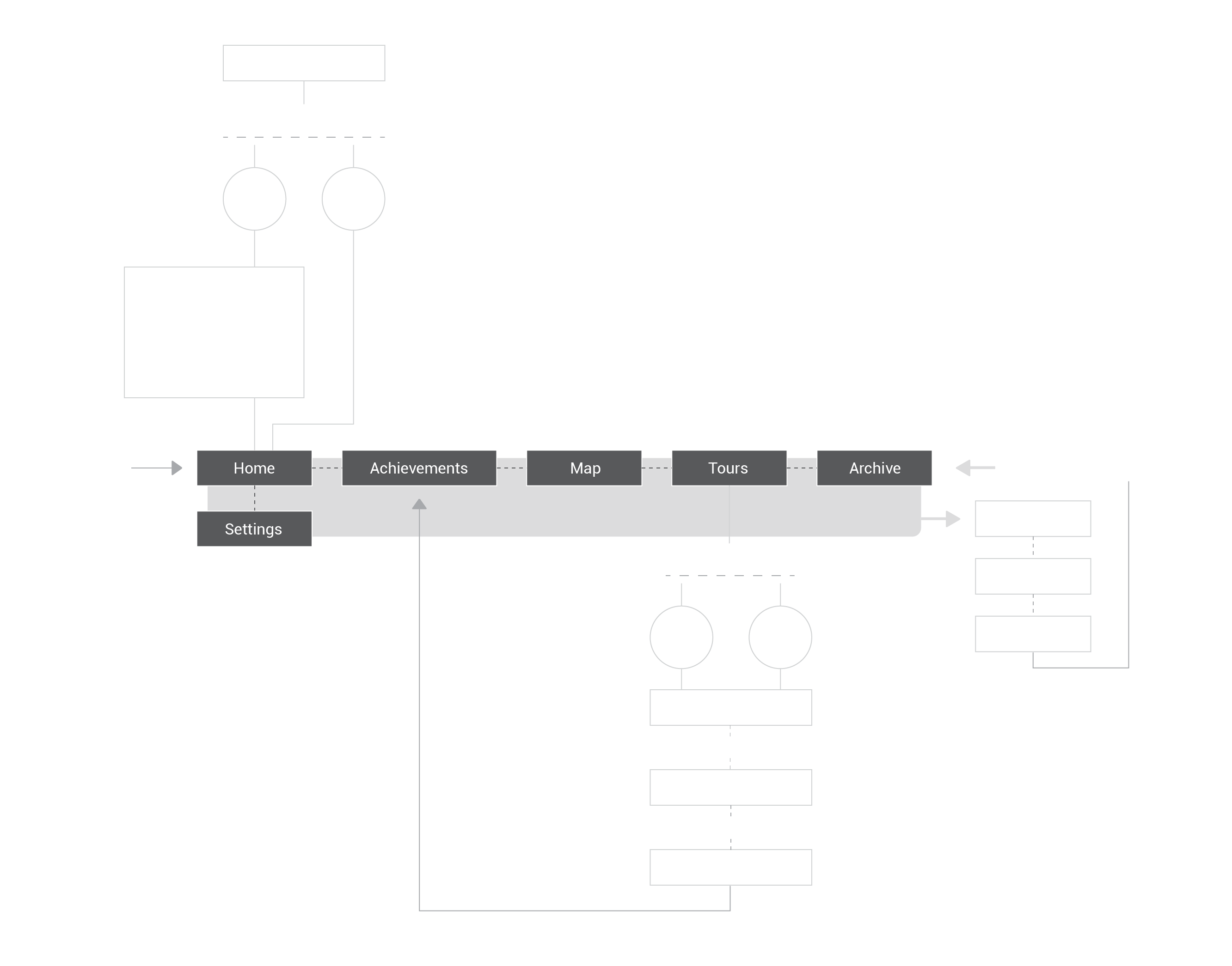
Sitemap
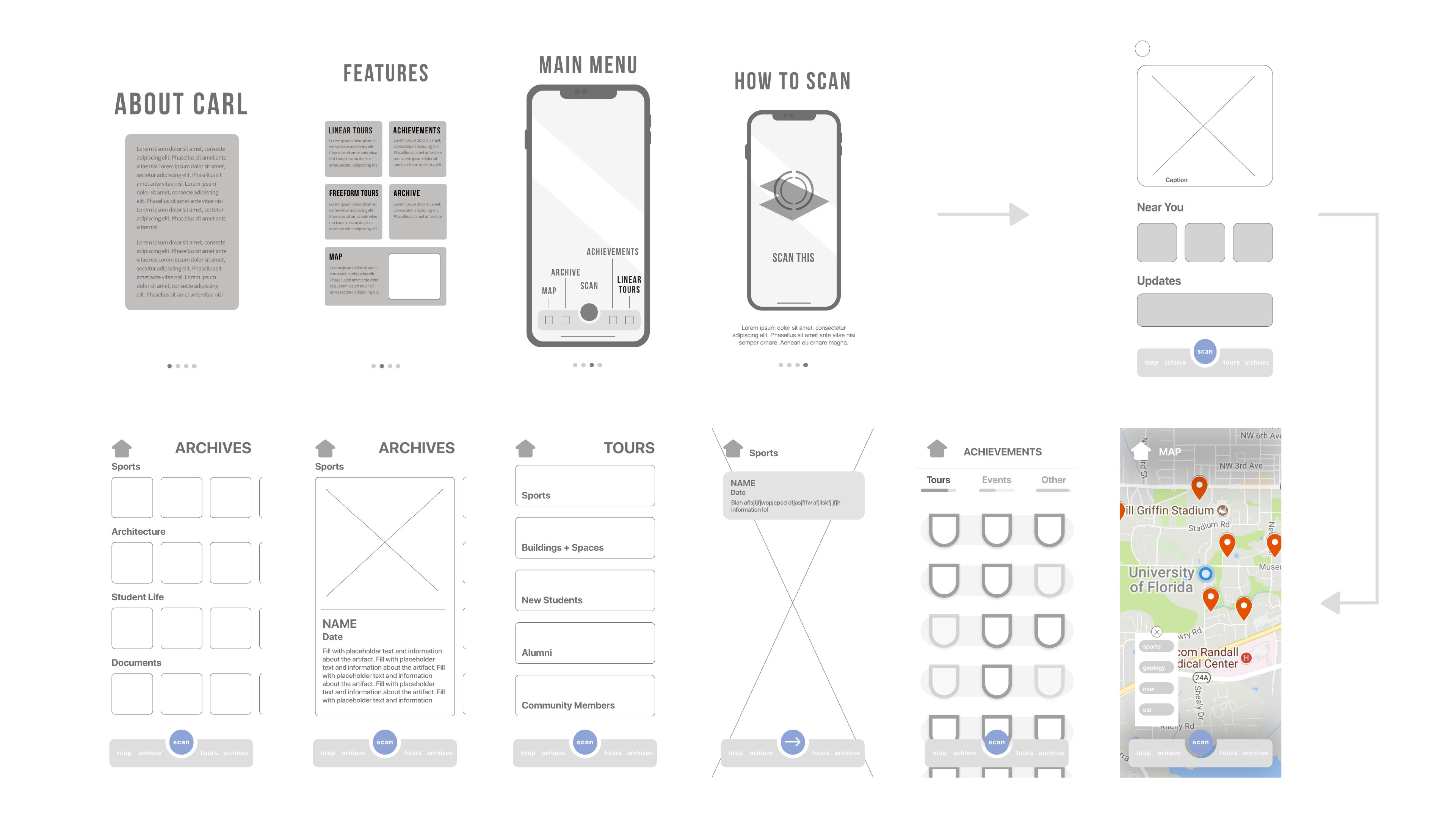
High Fidelity Wireframes
User Testing:
Round 1: Client interacted with high fidelity wireframes in the form of a click-through.
Round 2: Potential user (19 year-old student) interacted with early version of prototype.
Round 3: Client and potential users interacted with final version of prototype.
User Testiing Goals:
Identify strengths + weaknesses with user navigation
Identify processes and user flows that require simplification or clarification
Observe patterns in users' behaviors while interacting with app features
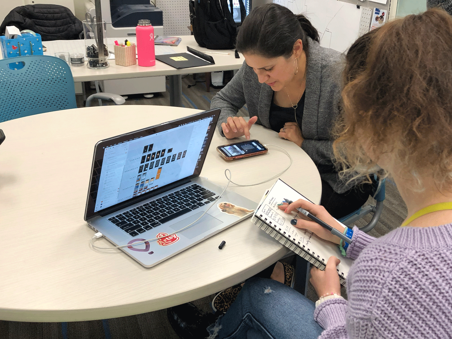
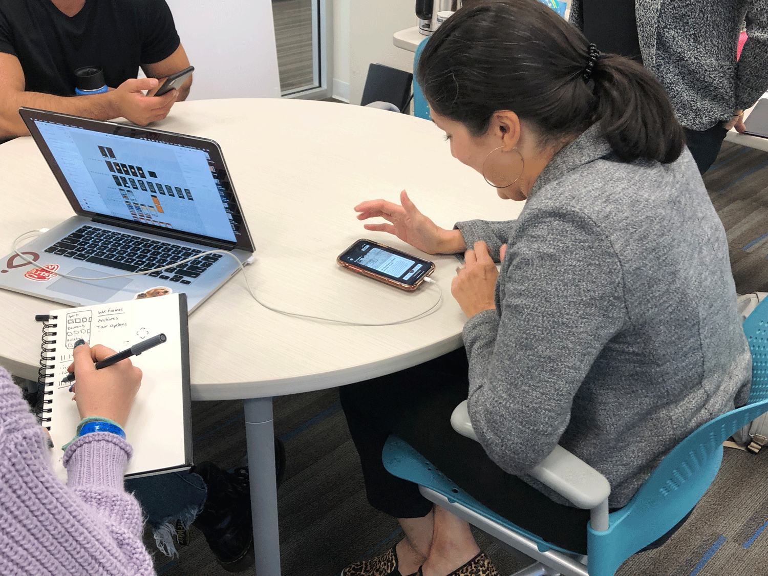
User Testing with Client
All Rights Reserved © Sarah Cantor 2020