Live Eyes
Visual System / Website Design
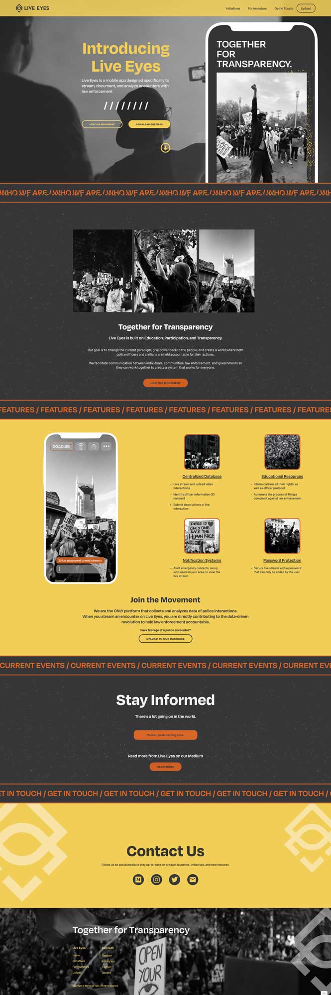
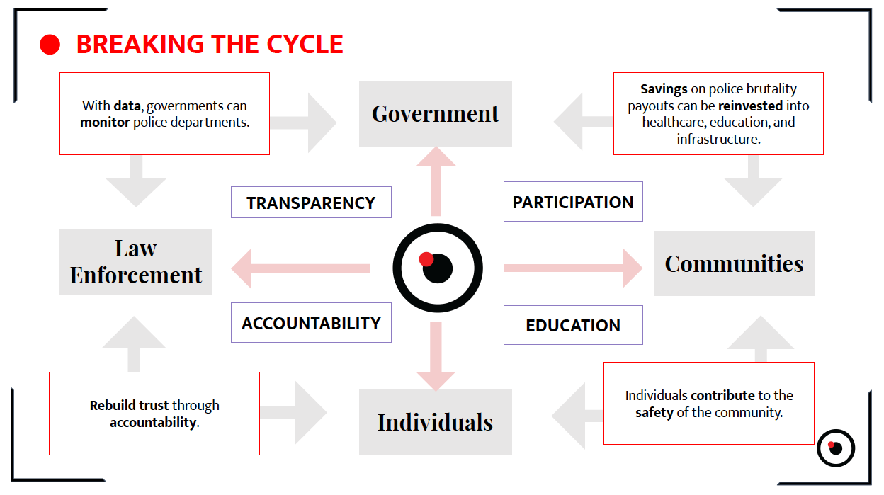
Live Eyes is on a mission to change the current paradigm, give power back to the people, and create a world where both police officers and civilians are held accountable for their actions.
Tasked with building a powerful brand identity, the final framework was then used to create a website where Live Eyes could share their mission with the world.
Logo Design in collaboration with Nicolaus Sherrill

| research + discovery |
Original Brand:
Live Eyes came to me in need of a completely new brand framework.
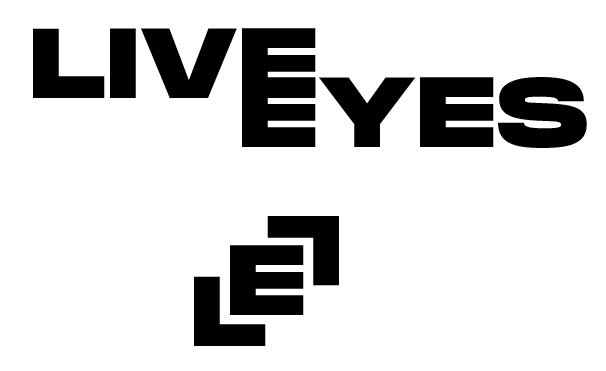
Their existing logomark resembled an eye with a recording light on, which didn't convey the true purpose of the app. Their color scheme was comprised of white, black, and red, which didn't properly translate the brand's personality. Live Eyes lacked a cohesive type system and any sort of brand visual unique to their mission.
Deliverables:
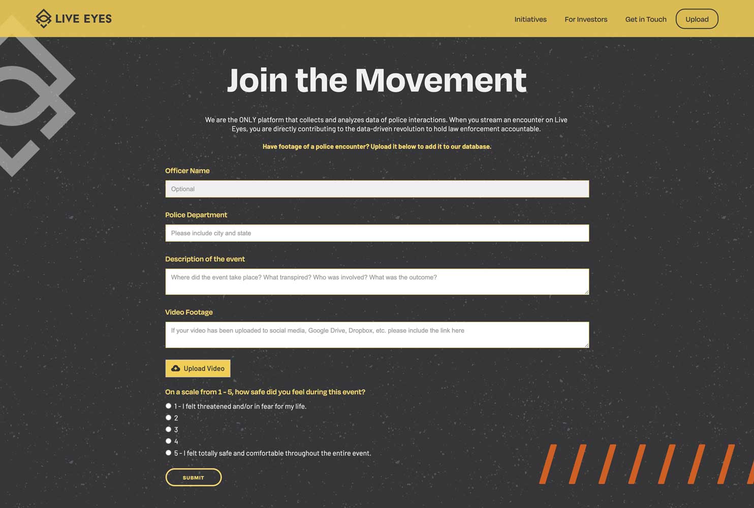
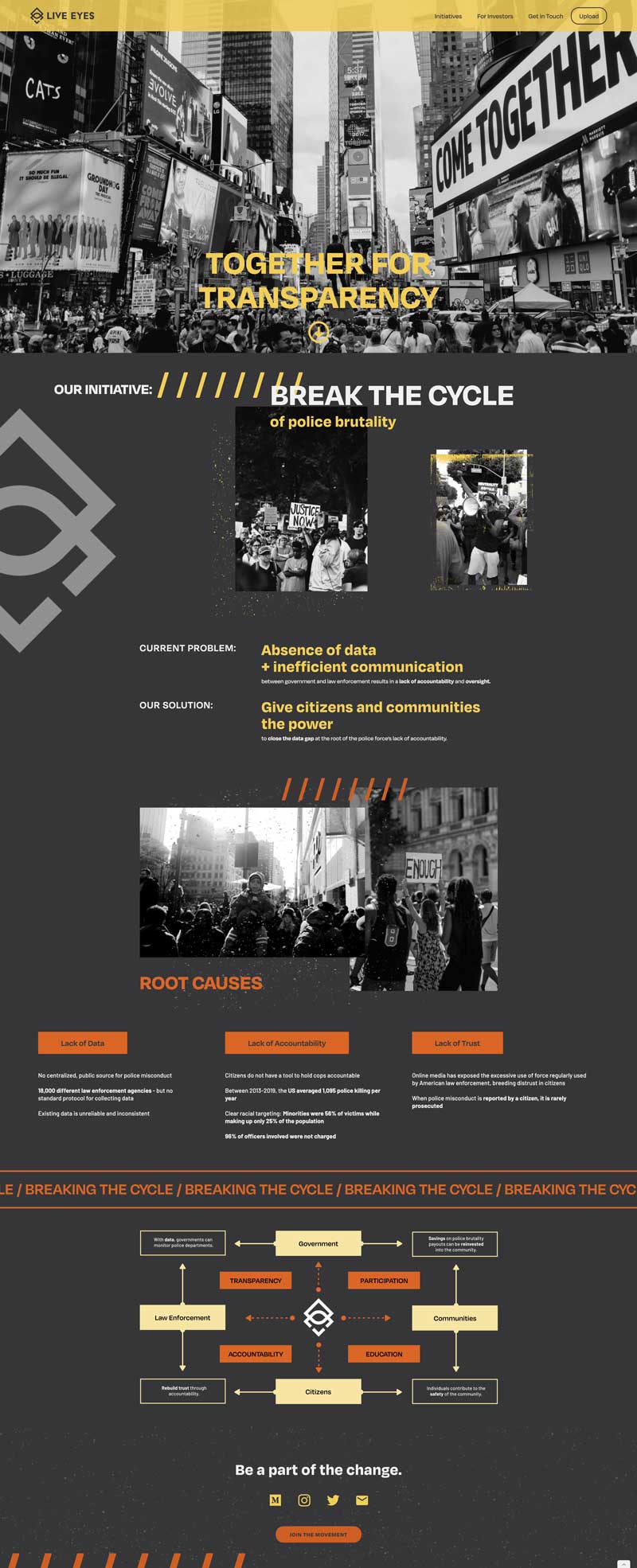
Website
Logomark
Logotype
Color Palette
Type System
Brand Assets (photography, textures)
Demographic Questions:
What is the age range of your target audience?
What gender(s) does your target audience identify as?
What is/are the occupation(s) of your target audience?
What does your target audience do in their free time?
Qualitative Questions:
What emotions should the Live Eyes brand evoke?
What words would you use to describe Live Eyes' personality?
On a scale of 1-5, is Live Eyes more playful (1) or serious (5)?
On a scale of 1-5, is Live Eyes more youthful (1) or mature (5)?
On a scale of 1-5, is Live Eyes more affordable (1) or luxurious (5)?
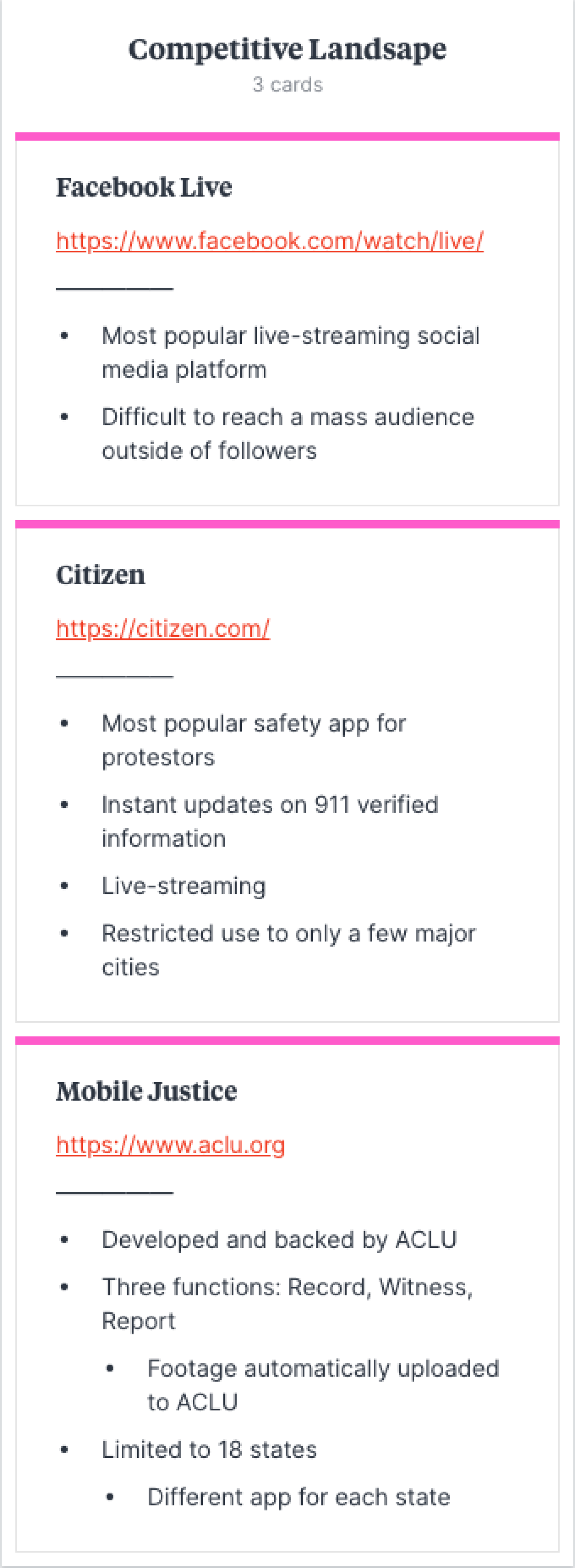
Competitive Landscape:
What apps/software exist in this space?
How is Live Eyes going to differentiate itself?
What is Live Eyes offering that users can't get elsewhere?
Why is Live Eyes going to be the go-to app for police encounters?
Objectives:
Build a powerful brand framework for Live Eyes to use as they gain investors, build an MVP, and launch their app
Craft a comprehensive website to communicate Live Eyes' vision, and start gaining traction in the community
| visual identity |
Process:
Preliminary Logo Sketches
Digital Logo Roughs
Final Logo Assets
Color Palette
Type System
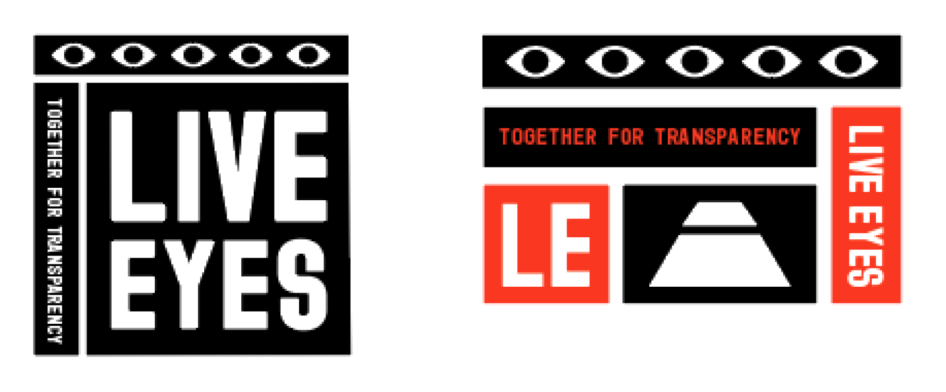
Visual Brand Elements
Visual Strategy:
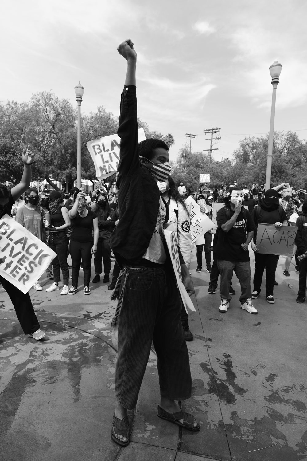
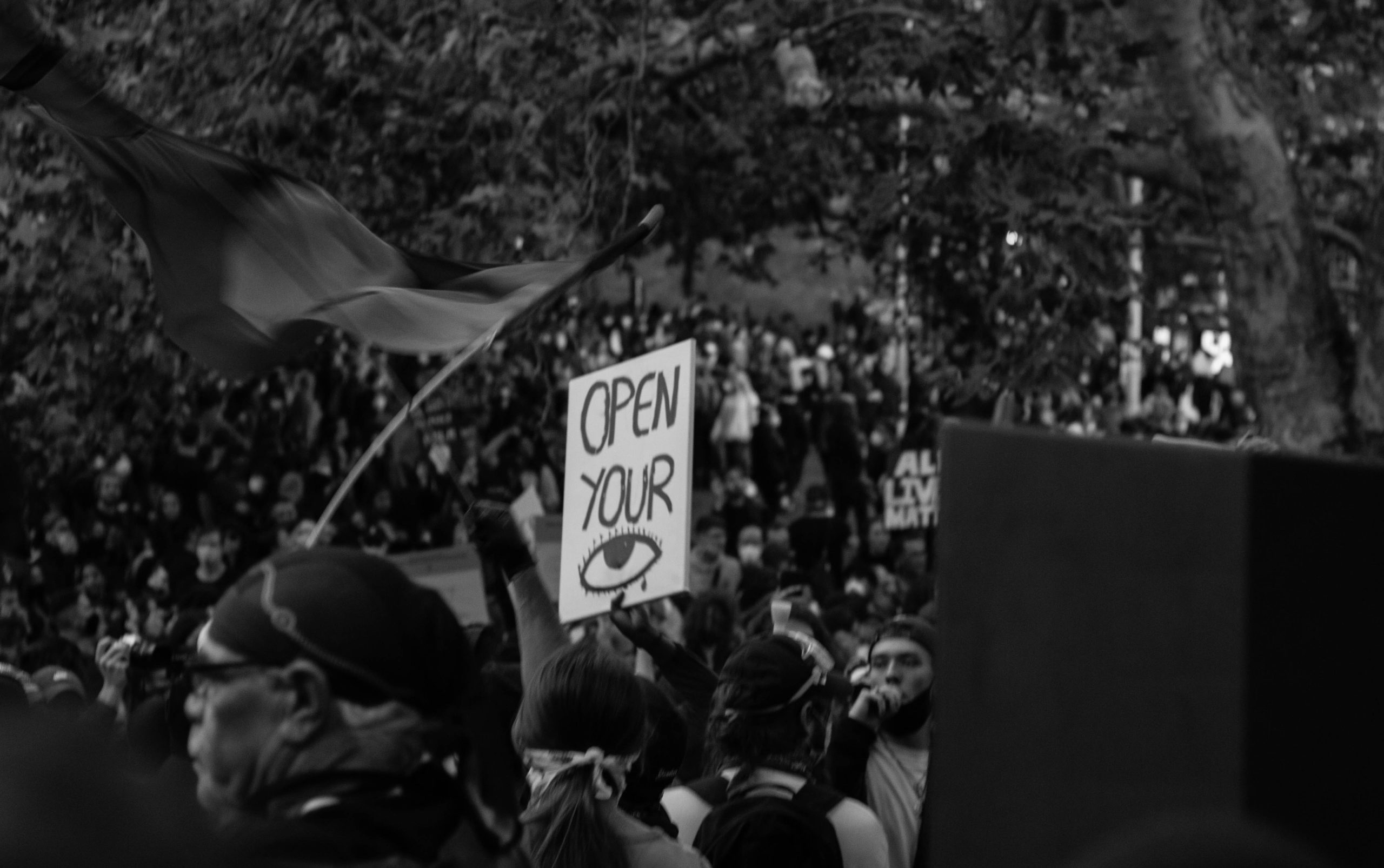
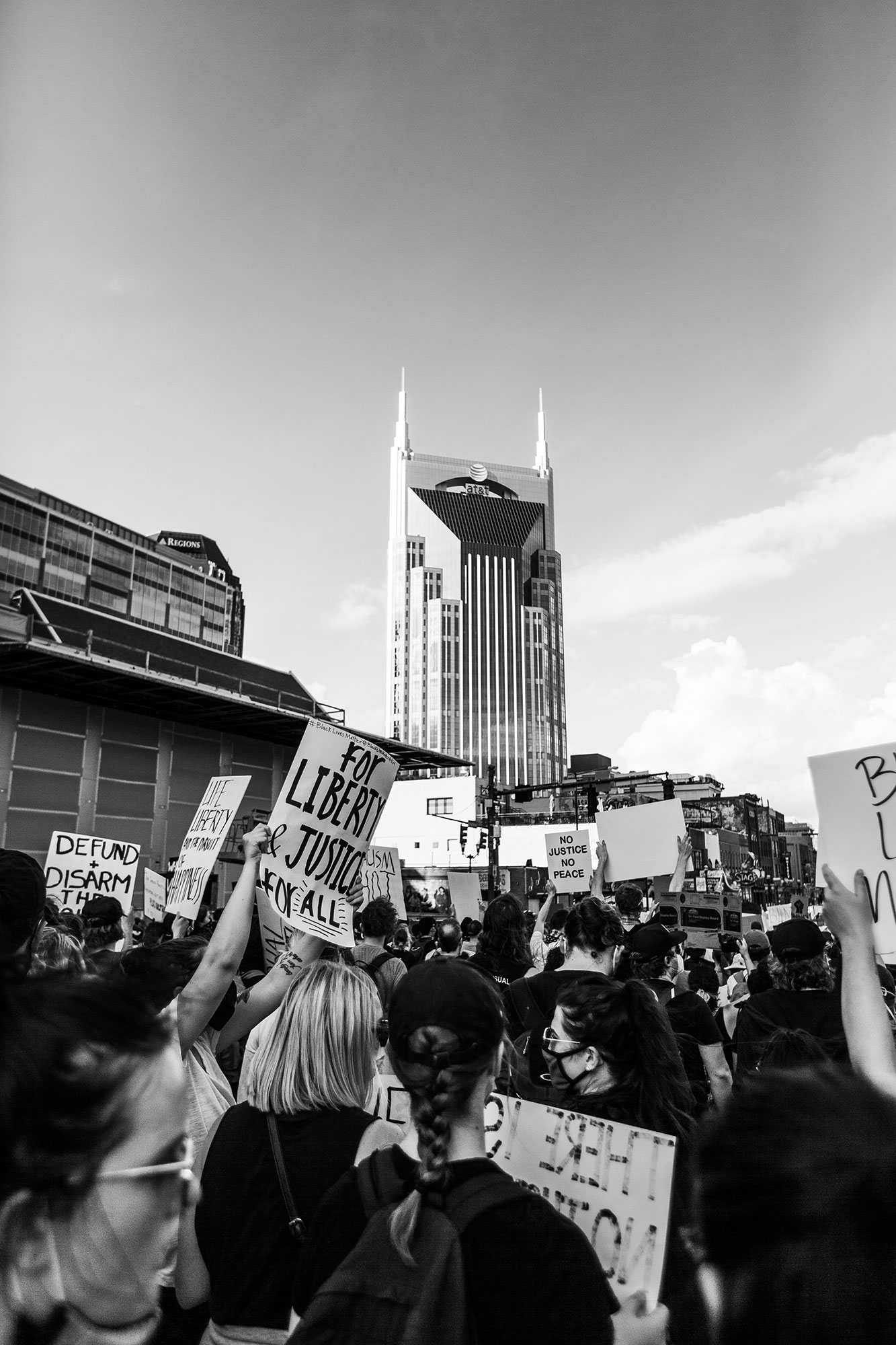
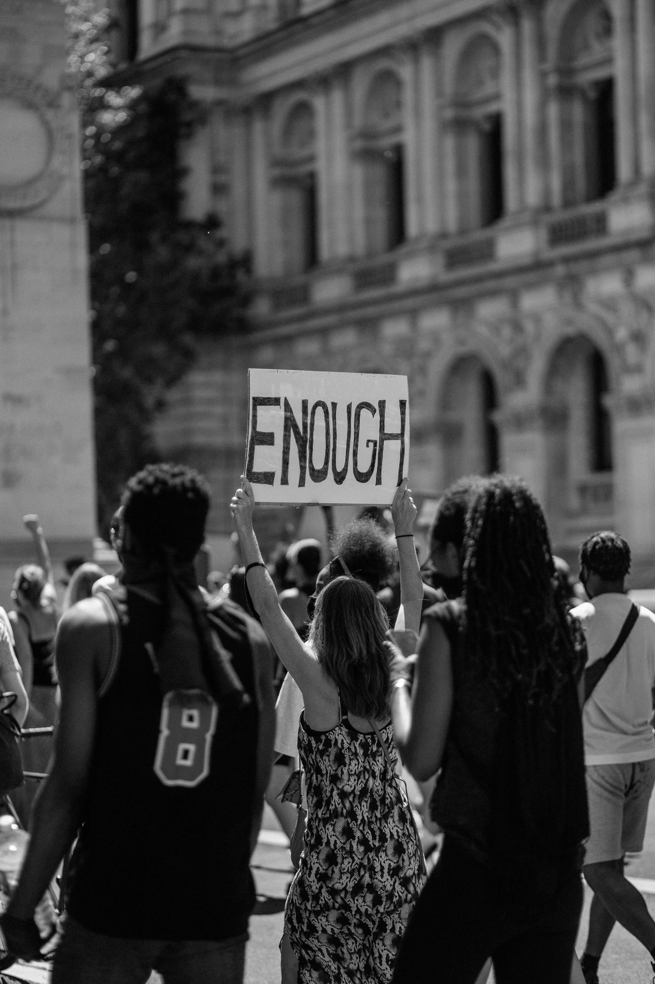
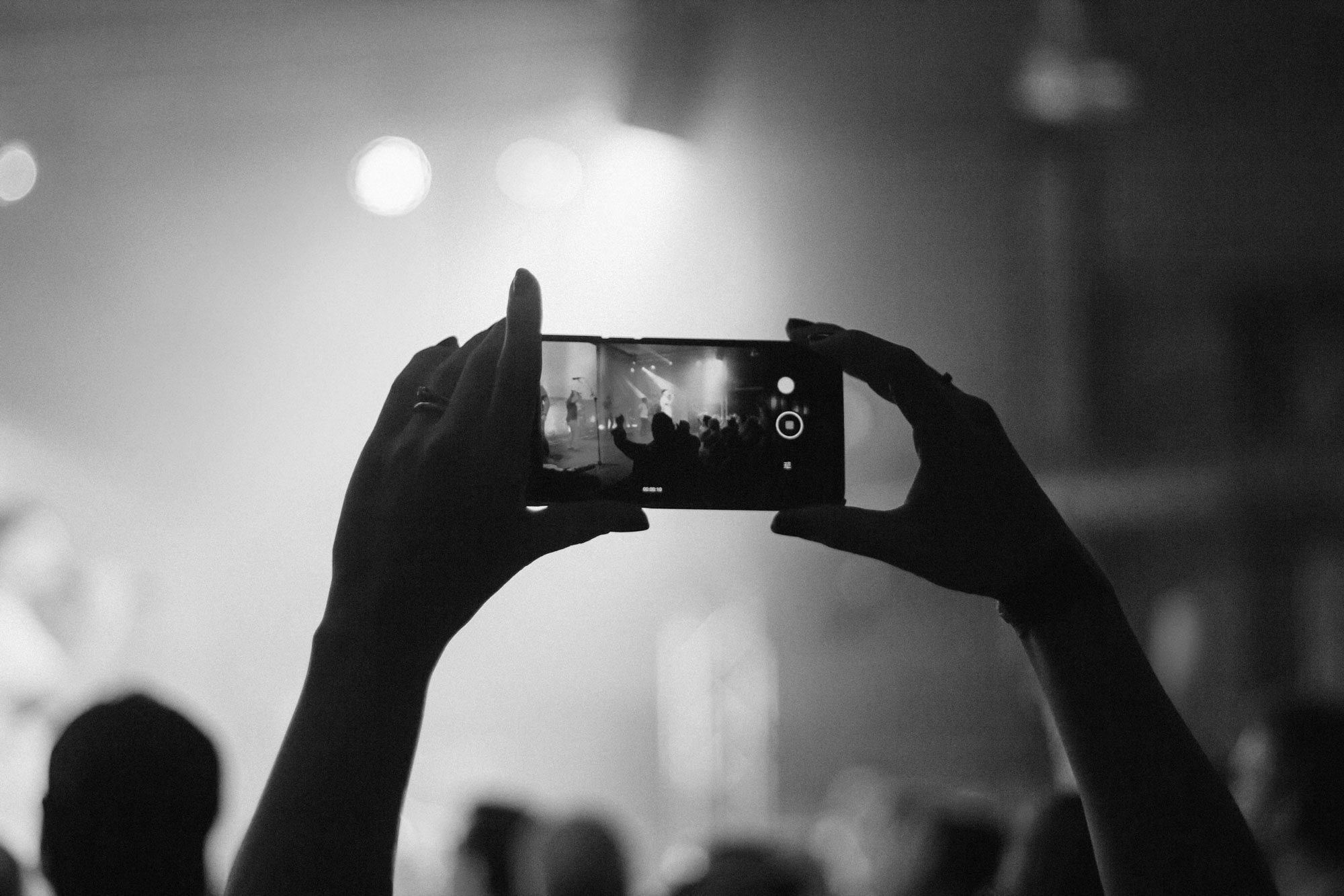
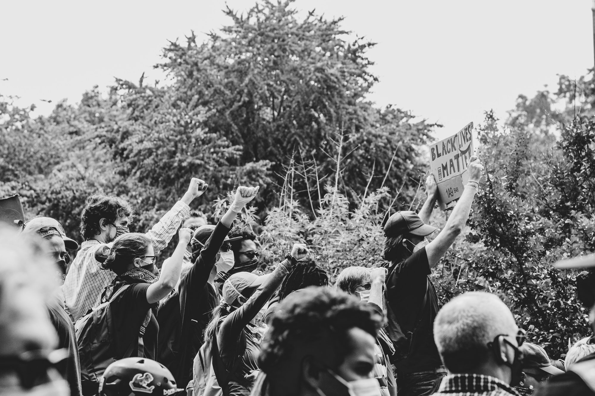
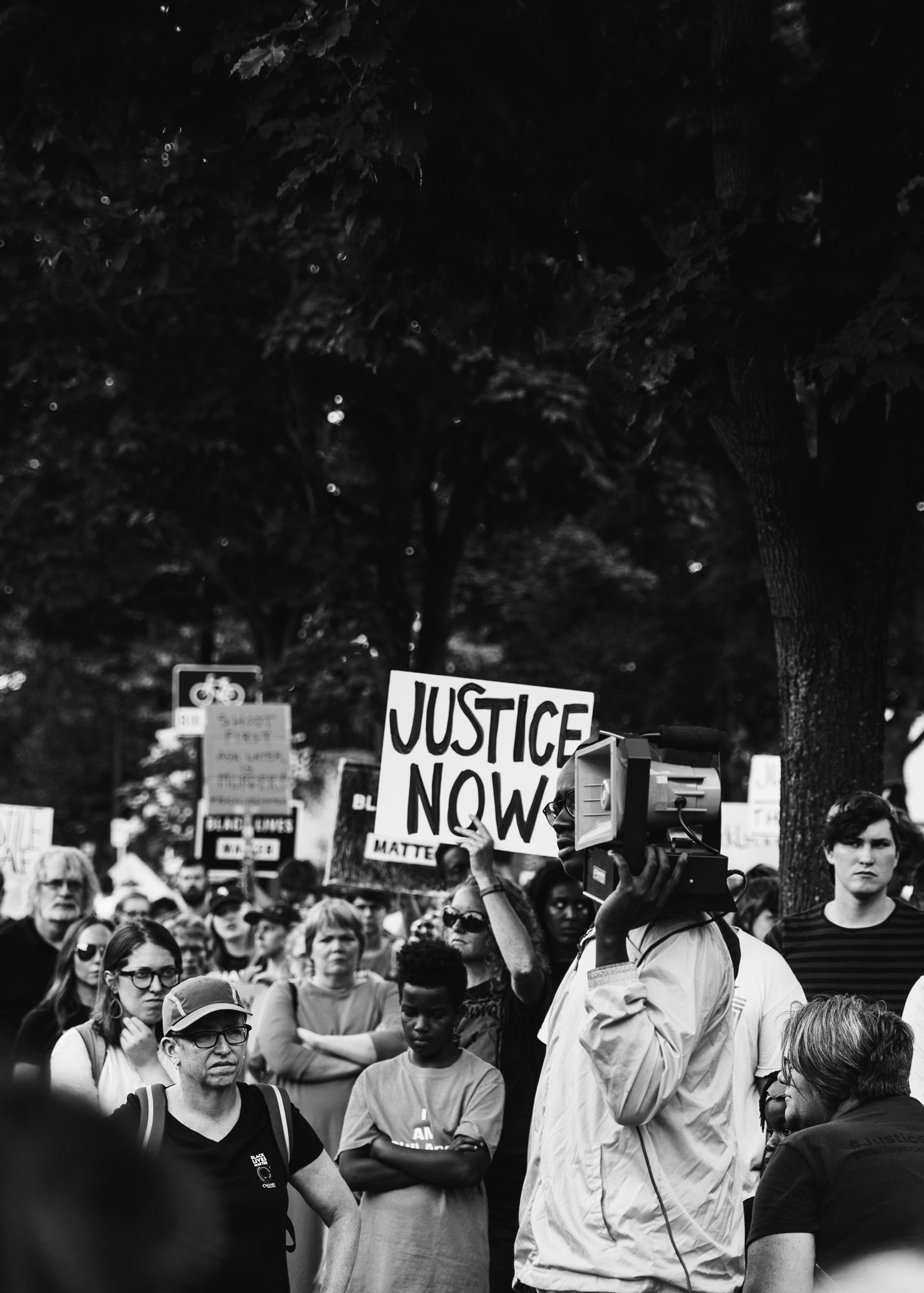
Create a sense of empowerment and cooperation displayed through powerful black and white imagery with striking accent colors
Appeal to politically active potential users (Ages 18-35) with street art-inspired visual elements
Incorporate the resilience and emotion seen throughout BLM protests from Summer 2020
Live Eyes is: Transparent | Trustworthy | Forward-thinking
Live Eyes is not: Aggressive | Combative | Anarchist
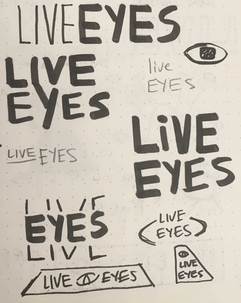
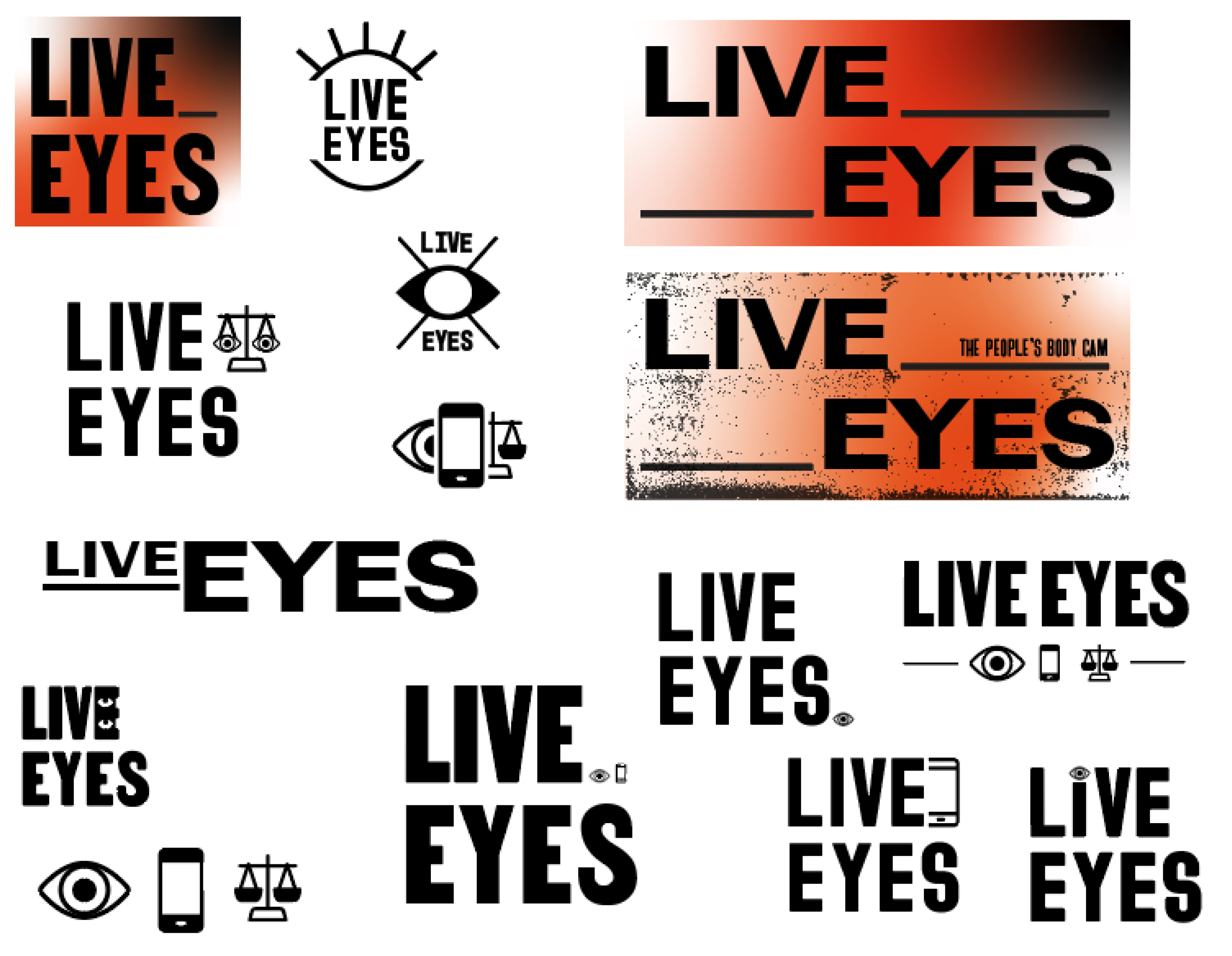
Preliminary Sketches:
After reviewing 6+ pages of preliminary sketches with the Lead Brand Designer, I decided to move forward with a type-heavy approach to Live Eyes' logo.
I continued to explore geometric shapes and how to symbolize Live Eyes' mission "to flip the balance of power." The co-founders and I also wanted to exhaust all possible options for incorporating eye imagery into the logo system.
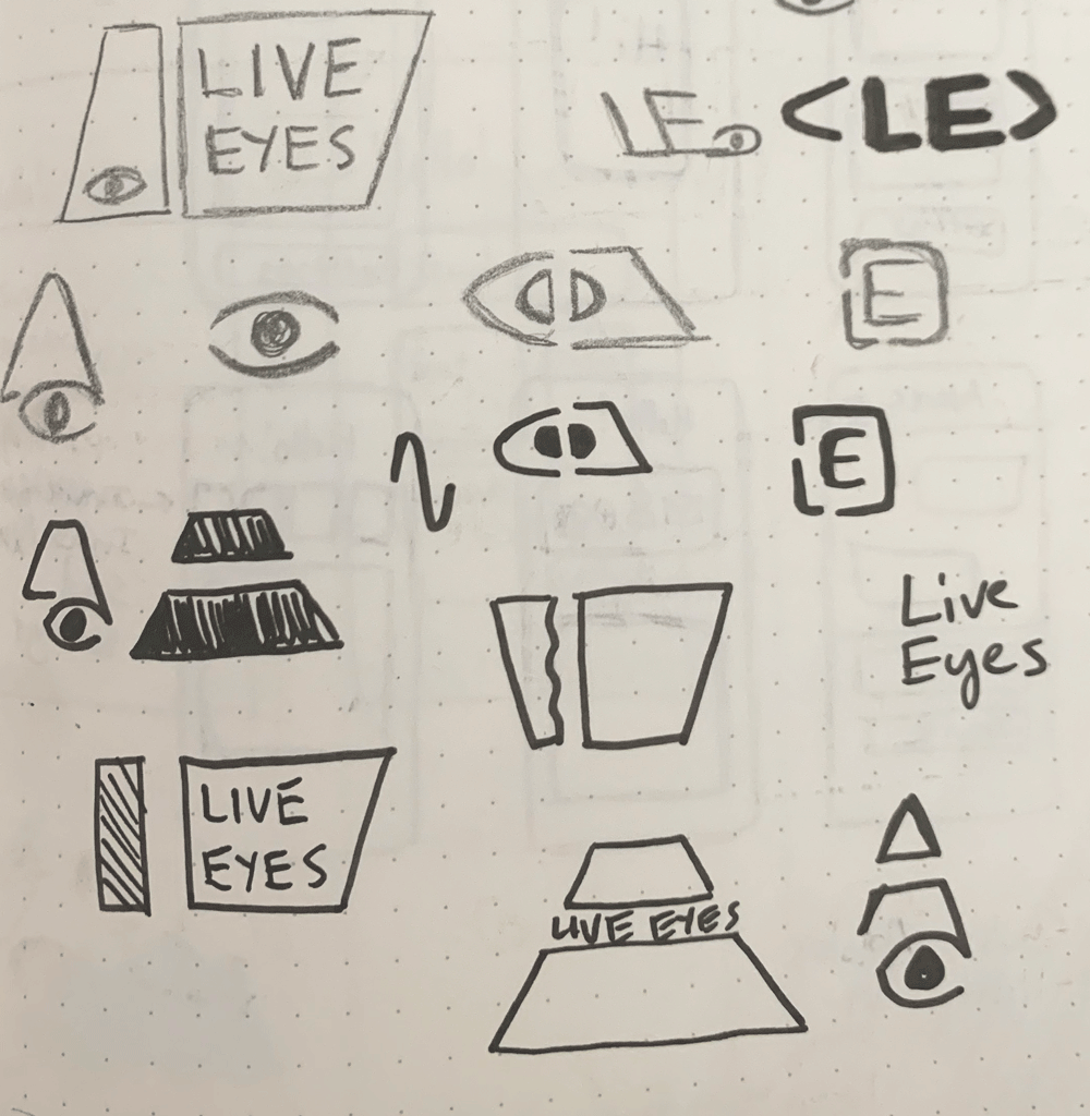
Chosen Direction
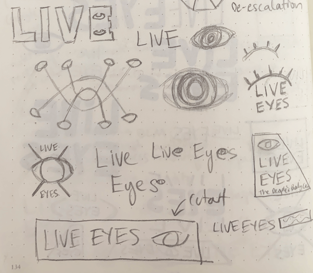
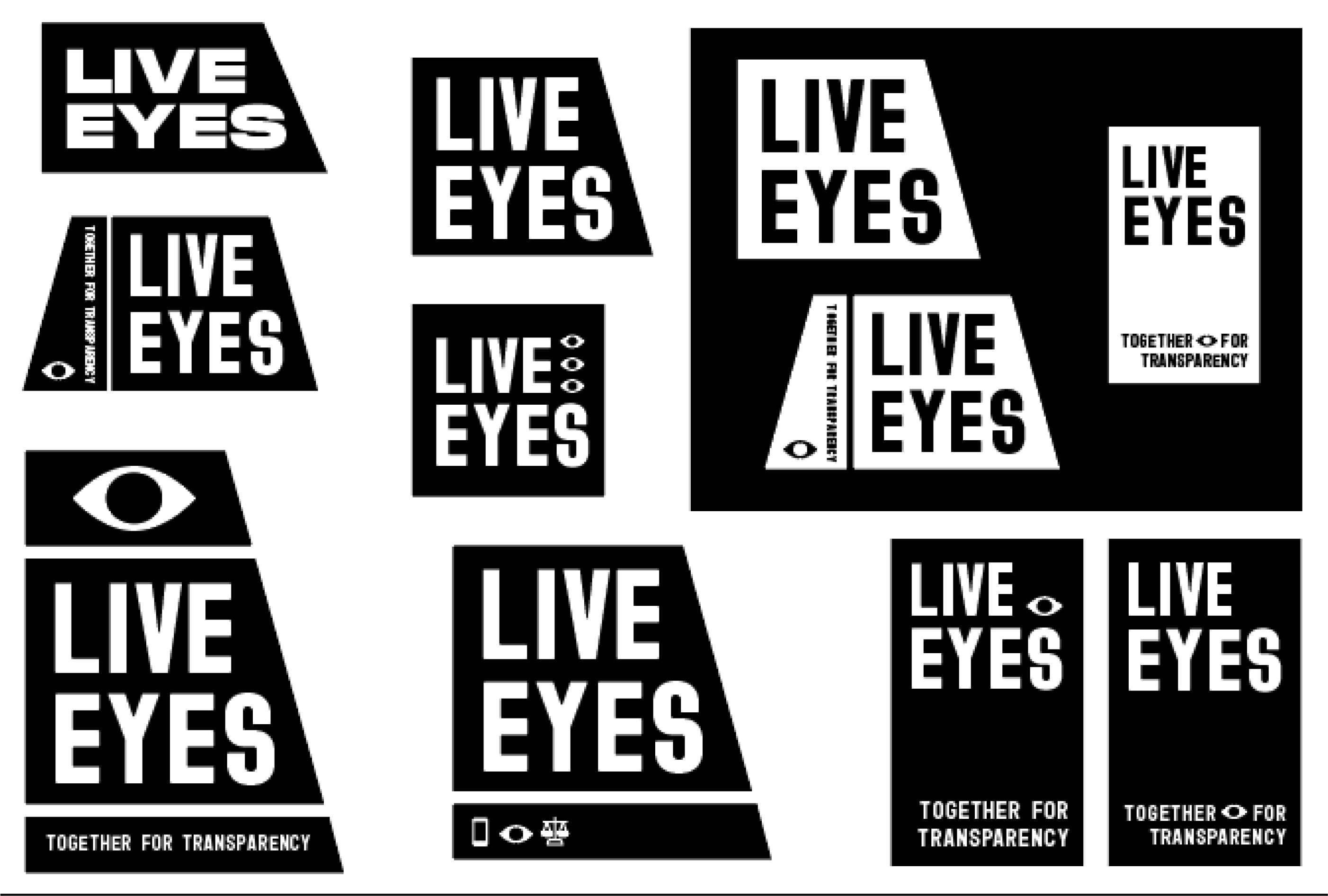
Digital Roughs:
After two rounds of feedback and countless iterations, the Live Eyes team decided on the logo direction, with help from myself and the Lead Brand Designer.
I continued to research the symbolism and prevalence of eye iconography, and ultimately decided to remove any literal representation of eyeballs from the logo. Eyes are often associated with secrecy, power, and knowledge. Live Eyes is about returning power to the public, so I wanted to avoid anything that could misconstrue the true purpose of Live Eyes.

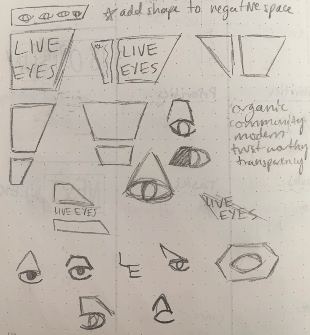
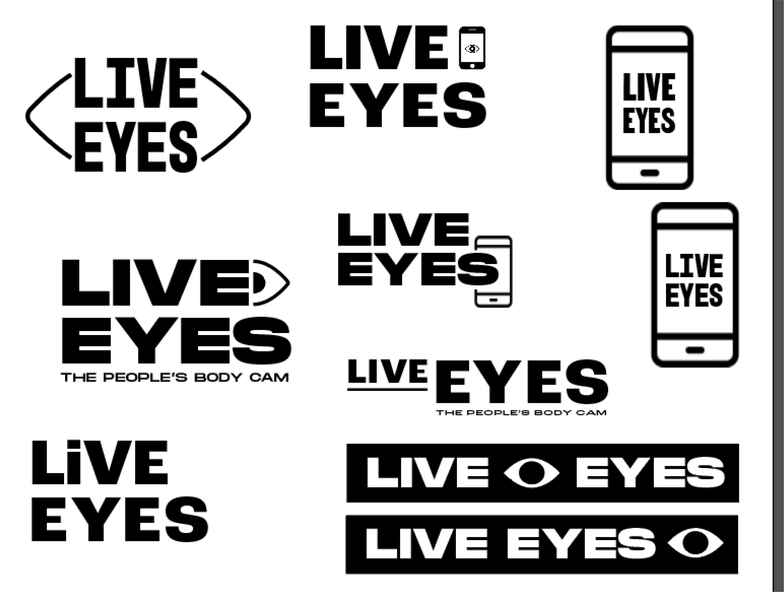
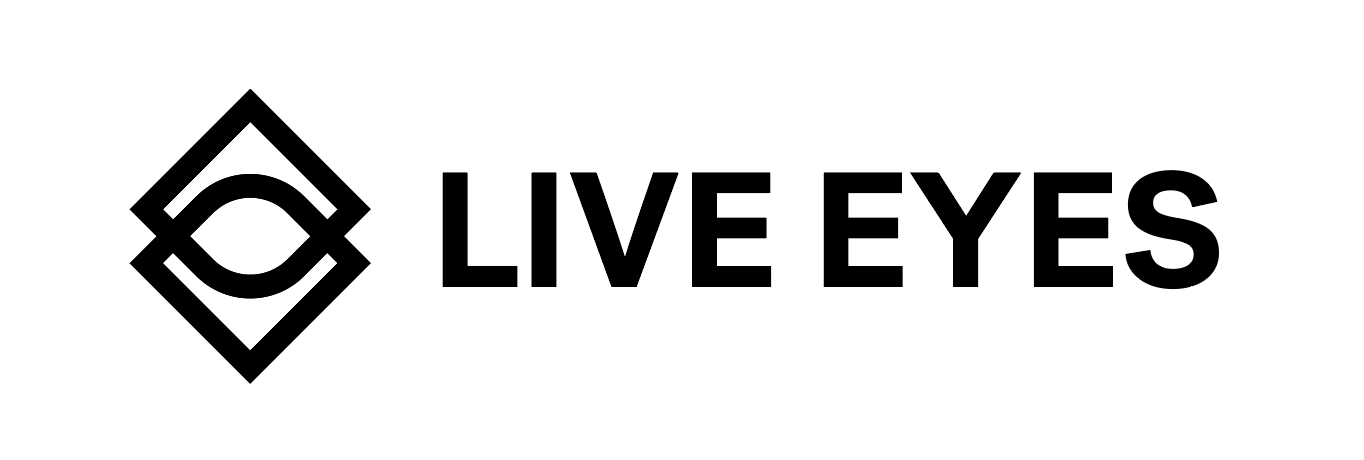
Final Logo:
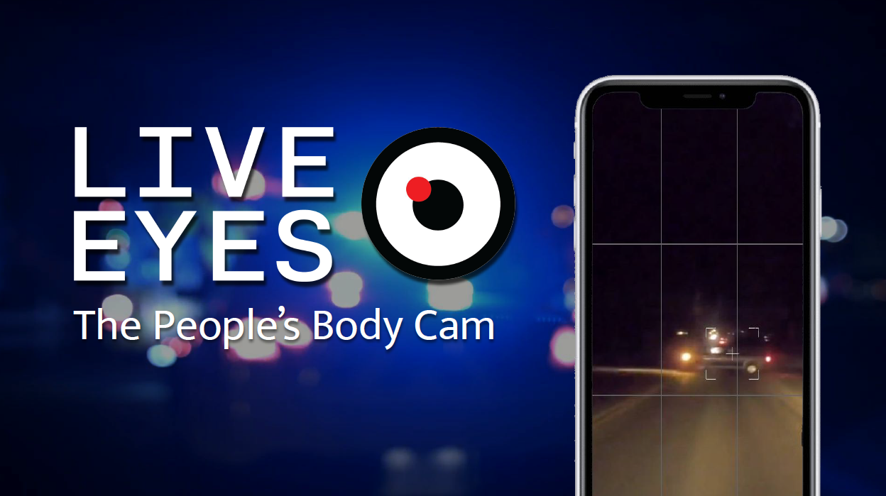
Live Eyes' primary logo consists of a logotype and a geometric logomark. The logo combines two squares with rounded corner to create an abstract eyeball form. The corner that's separated from the rest of the shapes is meant to reference the focus inside a camera's viewfinder.
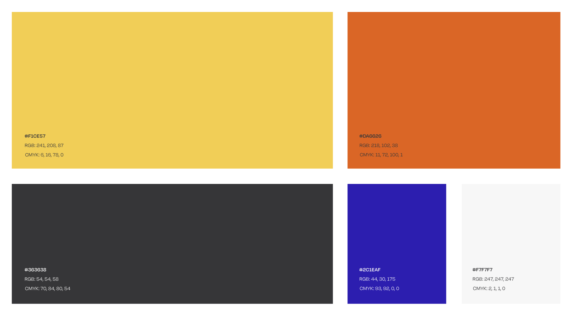
Color Palette
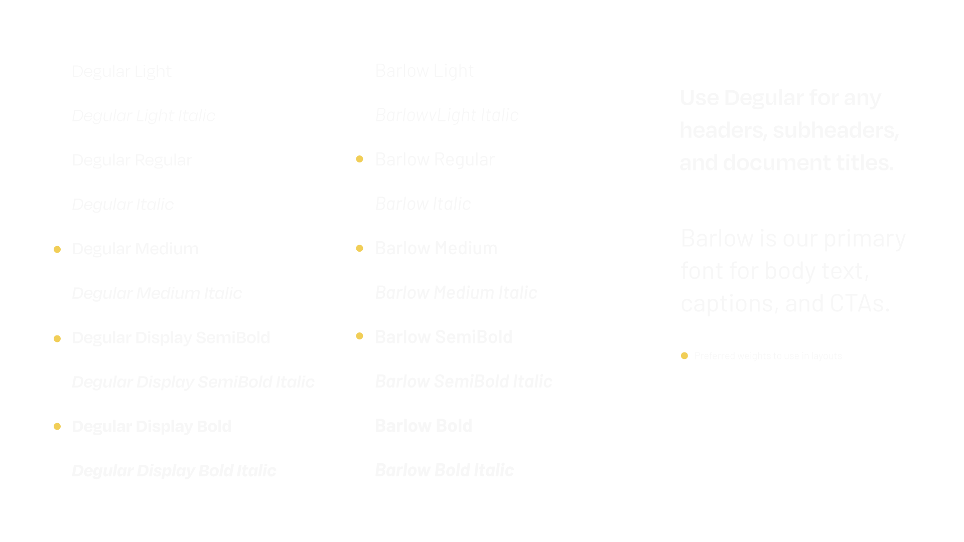
Type Palette
Brand Imagery
| user experience |

User Experience/Interface Goals:
Encourage potential users to learn about Live Eyes' mission and start contributing to their database
Utilize the user experience as an extension of Live Eye's brand identity
Give user's a preview of the mobile application's UI elements and animations
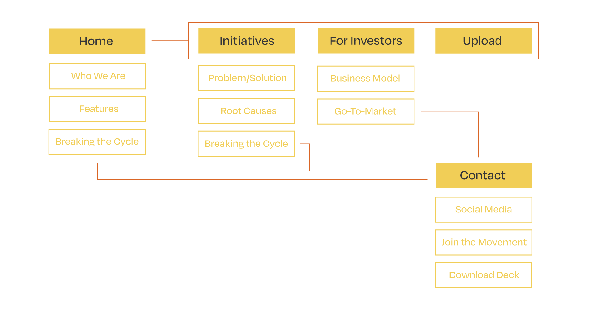
Site Map
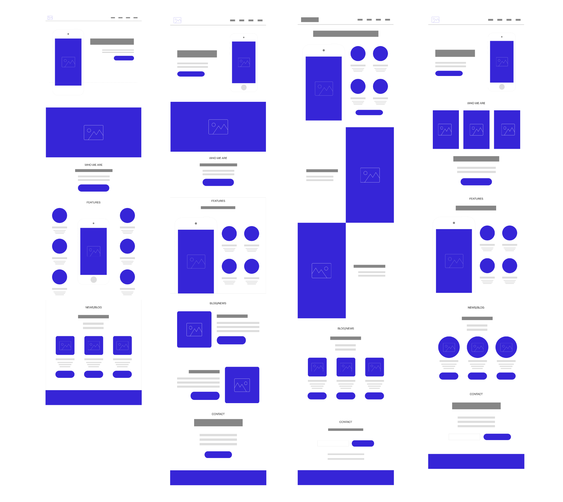
Wireframe Iteration
Brand Framework: Adobe Illustrator, InDesign
Wireframes: Figma
Website Design + Development: Webflow
All Rights Reserved © Sarah Cantor 2020